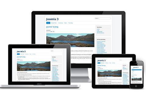
The framework for you website will display your content appropriately for any size device – from wide-screen desktops to small mobile devices.
Common applications
- Any type of website
- Any type of device – desktop, tablet, phone
- Even non-traditional “channels” (e.g., digital signage, Flipboard, RSS, email campaigns)
One website, multiple devices
Every site that Careytech builds is “responsive” – meaning you enter the content once and the display will respond appropriately for whatever device the page is being viewed on. Images and fonts resize, modules reposition, and the menu bar collapses into a dropdown button. You don't have to worry about that - just add your content - only once! “Mobile-only” sites were never a good idea as they required you to maintain two copies of all your content.
Today’s cutting edge goes beyond “responsive design.” Content – text, images, and links – is stored independent of the web page that displays it. This allows your content to be channeled through other media types such as Flipboard. Further, this approach arguably future-proofs your content so it can be used in new ways not yet invented.
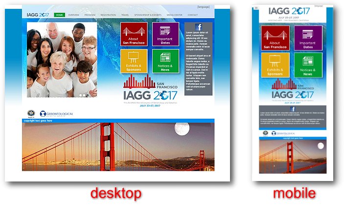
Example
In this visual example, we were asked by a web firm to develop a responsive template that could be reused for various conferences held by the IAGG (International Association of Gerontology and Geriatrics). Not only do the web components resize and reposition as the screen width changes, but some parts appear or disappear depending upon desktop-vs-mobile versions.