projects

High-end Sign Company: Major Upgrade

client: Warren Sign

summary:  Warren Sign is the largest and most prominent sign company in the St. Louis area.  For example, they provide nearly all signage at Busch Stadium.  They realized they needed a website overhaul and was impressed with another site we built, so they contacted Careytech.  As often is the case, they trusted us to developed an entirely new look as well as a complete reorganization of their information architecture.  And being their product is highly visual, we developed a system allowing them to easily manage their many photo galleries along with project descriptions.  What you don't see... We invented a system where client's can login, see a page of all signs on their premise, and click the respective link to request 24-hour service for that particular sign.  Tell us your business need, and we'll solve it with an emphasis on ease and usability.
Reorganize Content and Modernize

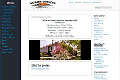
Adams County home page - a lot of content displayed efficiently and intuitively

client: Adams County

summary: Adams County was living too long with an aging site. Counties have many departments which often leads to disorganization with disparate navigation. Once Careytech was enlisted, we took all the content from the original site and strucutred it afresh - into intuitive and fast navigation. The content management system was tailored for non-technical authors to add just content which is auto-formatted into a aconsistent look-and-feel across all departments. And, of course, they now have a 100% mobile site.

United Nations affiliated site

Pan American Health Organization

client: Pan American Health Organization

summary:  A satellite organization of the United Nations, PAHO uses this multi-lingual site to distribute news and health information for all of North and South America.  Careytech, a recognized specialist with Joomla-based sites, was recruited to consult and address some concerns they had with this site.  We investigated the reported issues, discovered their causes, and responded with the solutions.  As is often the case with sites holding a large volume of information from distributed content managers, we discovered and reported some significant problems with their content strategy and followed up with guidelines that addressed these.

From Do-It-Yourself to Professional

AVA HiFi - detailed page for one of their high-end custom sound components

client: AVA Hifi

summary: The client customizes high-end home sound systems for professionals.  They came to us with a do-it-yourself site.  Careytech proposed a professionally built site. We migrated their cut-and-paste product listings to an ecommerce cateloging system. We extracted their many years of content and ported it into a new CMS. We assesed this content and developed a new information architecture and menuing structure. The owner wanted to retain some minimalism and visual elements of the old site, and we worked together to find the right mix of graphics.  Of course, they now have a responsive (mobile) site. Once staff started using this new system, they wondered why they waited so long.

Hard-but-Needed Assessment

Yellow Pages franchise

client: <unnamed> Yellow Pages franchise

summary:  This client was another victim of cheap third-world labor (we see this fairly often).  After spending tens of thousands and a year+ on development, the client asked Careytech to take over the project.  We began by assessing what had been developed so far and then proposed (a) a path forward and (b) a new online model that works for the Yellow Pages franchises that are successful when moving to the web (we did our research). We told it like it was - the site and its mobile app had significant architectural problems, would be a burden to maintain, and needed to be rebuilt.  (We could do that in a fraction of time and dollars.)  Some clients don't want to give up on bad investments, and sadly this client chose to stay the course, so we wished them well and parted ways. 

We will tell our clients what they need to hear while proposing solutions.  We'd rather let go a paying client than pursue with them a path that we feel leads to waste and failure.

International Magazine - Upgrade and Migration

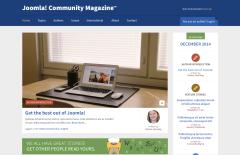
summary:  Randy was selected to lead an international team toward the migration of the Joomla Community Magazine to a new platform.  Challenges include migrating over a thousand articles spanning thirty different languages. The opportunities included improved workflows, new fields and features, improved DAM (digital asset management), and an entirely new look-and-feel. Randy was also the project’s content strategist, a role through which he re-evaluates the current system and seeks editorial feedback as he architects a new system with improved content structures, asset management, and editorial workflows.

Distributed Email Campaign

client: ad agency for a parts manufacturer
custom web application

summary:  Recruited by an ad agency, Careytech developed a web application that manages and launches promotional campaigns by a manufacturer of auto parts.  The manufacturer creates discount and rebate campaigns through its website.  Hundreds of stores that sell its products are notified of the upcoming campaign with details and a sample promo email.  Each store can opt in or out of participation. When the campaign is launched, all subscribers of participating stores are notified with the promotional email (personalized with the subscriber's and store's information).  Integrated with the Joomla CMS and tying in to a professional email service, the manufacturer can monitor email statistics of each campaign.

Corporate, Multi-Lingual

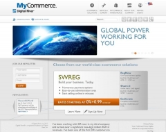
client: Digital River

summary: Digital River® was unsatisfied with their agency-built website for their MyCommerce product line.  Competing against heavy-weight CMS providers, Careytech earned the project by demonstrating its ability to provide multi-lingual sites, multi-team management of various sections, and workflow management.  

Leads Dashboard

end client: Door County Navigator
custom web application

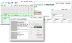
summary:  A Chicago web firm recruited Careytech to build a web application that would replace a slow-and-tedious manual process.  The DCNavigator site fields requests from its viewers and passes them on as leads to resorts in prestigious Door County Wisconsin.  This custom application collects the requests through an online form and immediately notifies each resort matching the requested criteria.  Throughout a lead's lifetime, emails are automatically generated and sent to users, lodges, and the system administrator.  Each resort has a login that leads to a dashboard to view and manage each of its leads.  The system's admin received emails and reports allowing them to recognize and monitor details such as unfulfilled leads, lodges that are not following through, etc. 

Classic Restaurant: New Owner, New Site

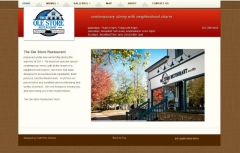
client: Ole Store Restaurant

summary: A current client for Careytech turned to us when they bought an historic restaurant.  First, they needed a modern website that reflects their atmosphere and their motto: contemporary dining with neighborhood charm.  The home page launches a stylish slide-show that reveals "neighbors" enjoying its atmosphere, decor, and food.  The online menus and galleries sustain this theme.  The About section tabs through the history, master chef, and a video on how the community-famous "Ole Roll" is made.

A second and very important need was their web presence....

County Website, multiple departments

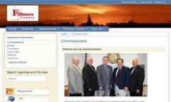
client: Fillmore County (Minnesota)

summary:  This nature-filled county needed to replace its old-school website.  Each department was interviewed to discover its own needs.  Old information was transferred and new content or functionality was created as needed.  With Joomla as the underlying CMS, we delivered a system where over a dozen departments, is some cases with minimal technical knowledge, can each manage its own department information.  The site is responsive, meaning each page autoformats as best suited for desktop, tablet, and mobile devices.

PR Firm, site Upgrade

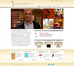
client: Kohnstamm Communications

summary:  A PR Firm has a lot riding on its public image.  Kohnstamm Communications turned to Careytech for a complete website overhaul.  After an analysis of competitor and similar sites, we built a contemporary and effective model.  Several features are worth noting:  A clean overall look-and-feel, streamlined navigation, a easily updatable homepage that includes a slide show and featured call-outs, heavy emphasis on clients and types of work, staff and firm information, a news section, and integration with social media. What does it say when a PR firm trusts us with their web needs?

Local Salon: wanted the best salon site in the community

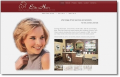
client: Elite Hair Salon

summary: Each project at The Studios begins with an assessment of the local competitor sites, a review of best-in-class sites for that industry, and a goal of delivering for our client a website that stands beyound those from its competitors.  Elite Hair Salon hired Careytech to do just that.  Now, not only do the salon's patrons leave as some of the best looking people in the community – Elite Hair tells us they feel they have the best looking salon website in the community!